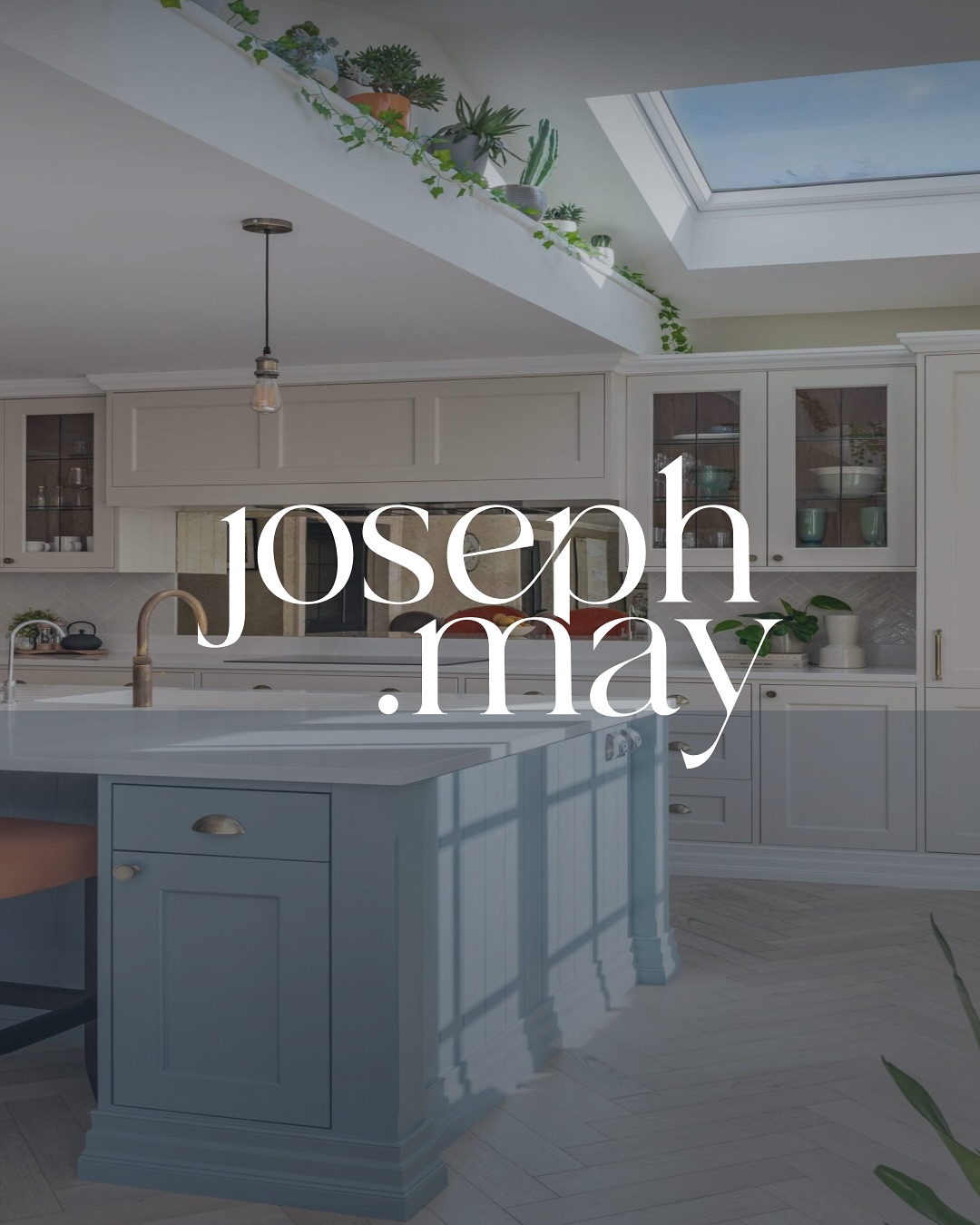
We are thrilled to show one of our latest and greatest projects. We worked on Joseph May’s website to bring the brand to life with a slick look and a user-friendly, oh-so-gorgeous site.
Joseph May creates high-end interiors by reimagining the most important spaces in their clients’ lives. Our job was to do the same thing online: design a website with both form and function in mind, so it looks as considered as the work it showcases and is genuinely easy to use.
Designing for a visual business
When a brand’s product is the way a space looks and feels, the website carries a heavy burden. It has to convey craft instantly, before a visitor reads a word. That meant leading with imagery, giving the work room to breathe, and resisting the urge to crowd the page.
Just as importantly, it had to be effortless to navigate. A beautiful site that frustrates people is a failed site. So we paired the rich, considered design with a clear structure and simple journeys, so prospective clients can move from admiring the work to starting a conversation without friction.
Form meeting function
The discipline throughout was balance. Every design decision had to serve both the aesthetic and the experience. Generous imagery, but fast-loading. A distinctive look, but an intuitive one. The result is a website that does justice to Joseph May’s interiors and works hard for the business behind them.
It is a good example of how we approach web projects for design-led brands: the craft of the build should match the craft of the client.


